With the rise of competitors in the grocery delivery space, Coles was falling behind in their mobile application, despite being one of the leading supermarkets in Australia.
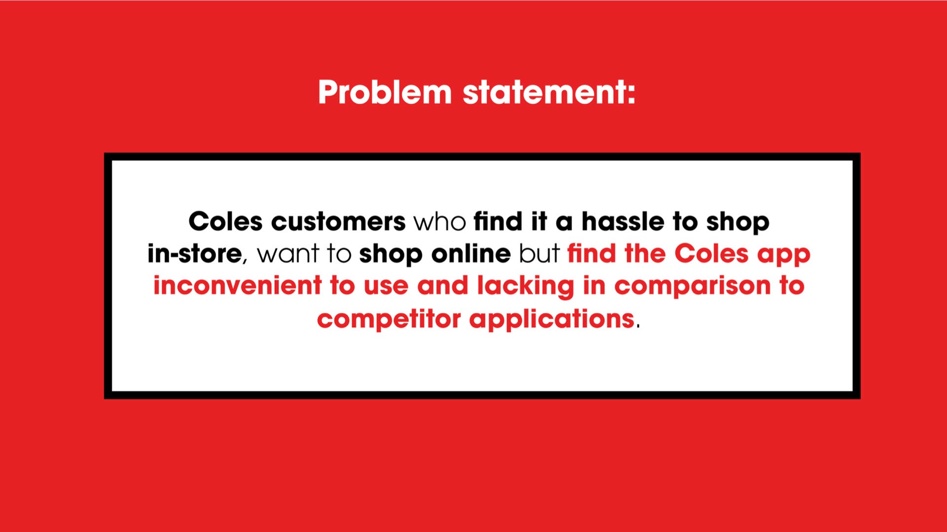
We were tasked with improving the UX of the Coles mobile app for customers who wanted to shop online, but found the current app inconvenient to use and lacking in comparison to competitors.
This project was completed as part of my course for Academy Xi UX/UI elevate.
THE PROCESS
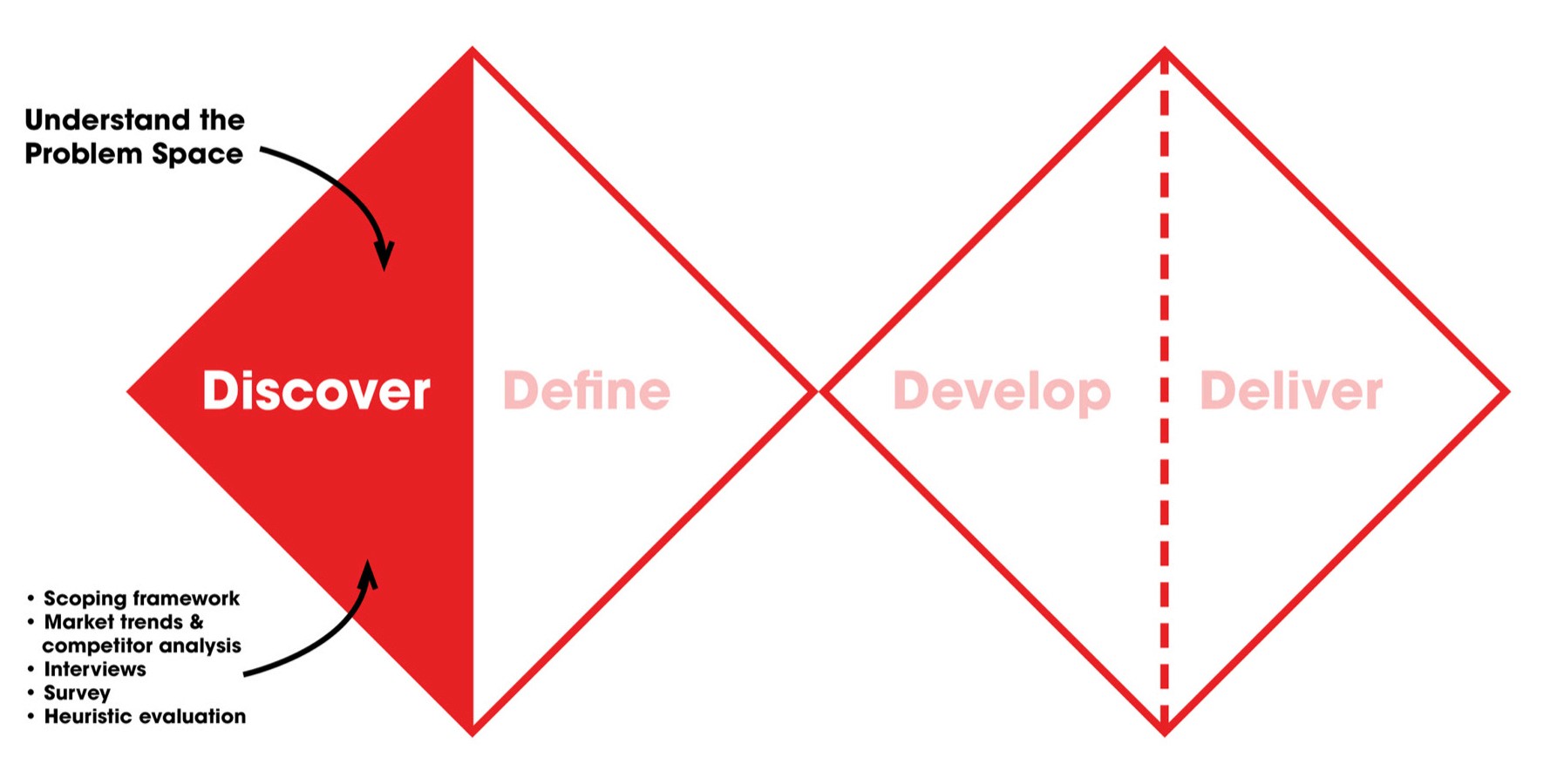
The Problem SPACE:
Coles was lagging behind its competitors with the mobile space. Woolworths had 3x the amount of ratings on the apps store, and at the time was ranked significantly higher in the shopping category. Grocery startups such as Voly, Mlkrun and Send – promising fast delivery in 15 minutes or less – were picking up momentum after launching the year before.
After both qualitative and quantitative research, this led us to our problem statement.
Defining the problem
We then moved onto defining the problem by synthesising research through the methodologies of Affinity & empathy mapping, personas and customer journeys.
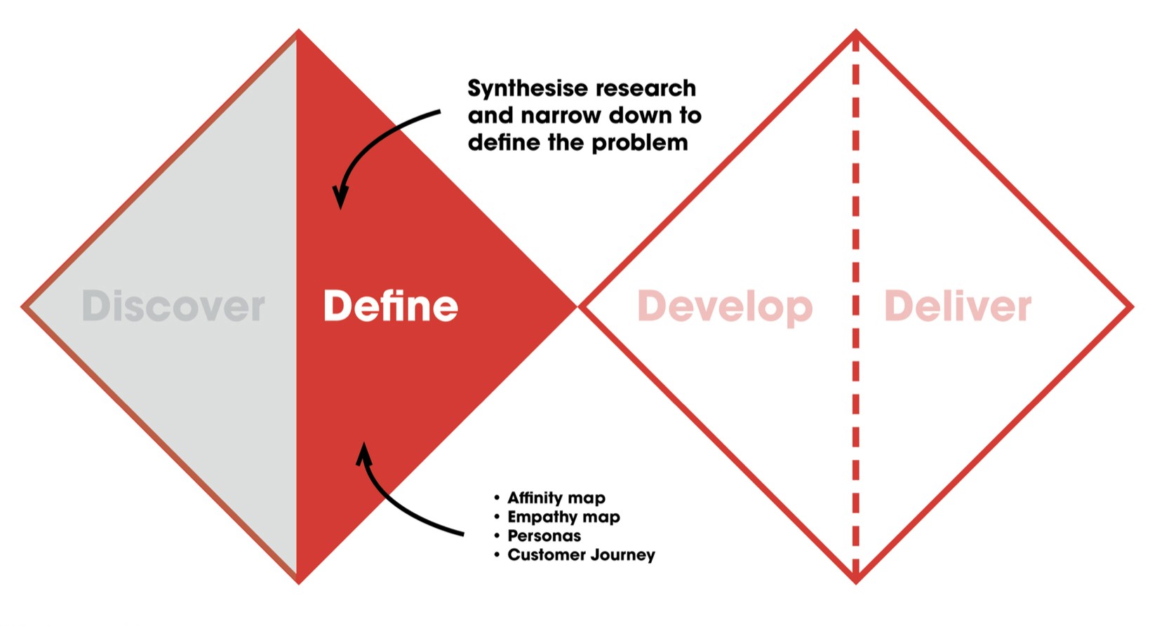
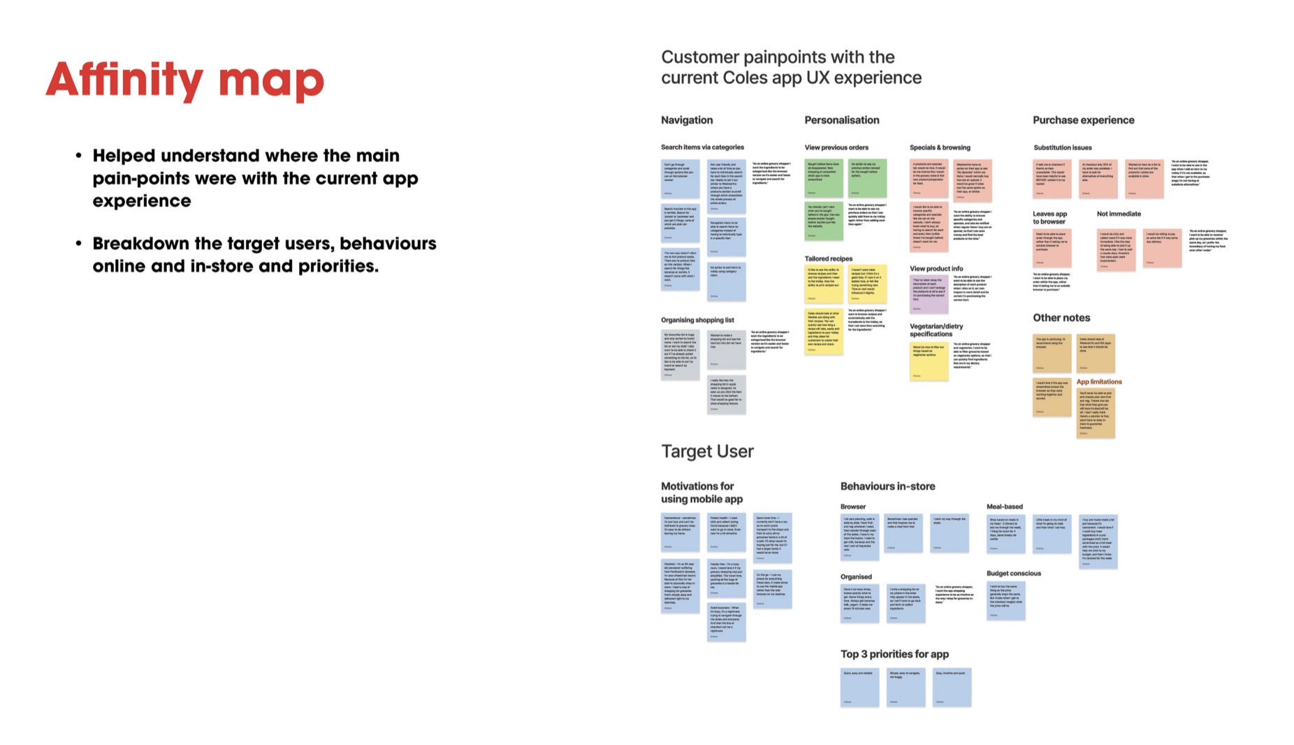
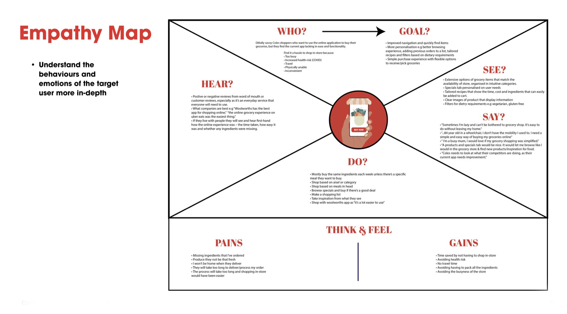
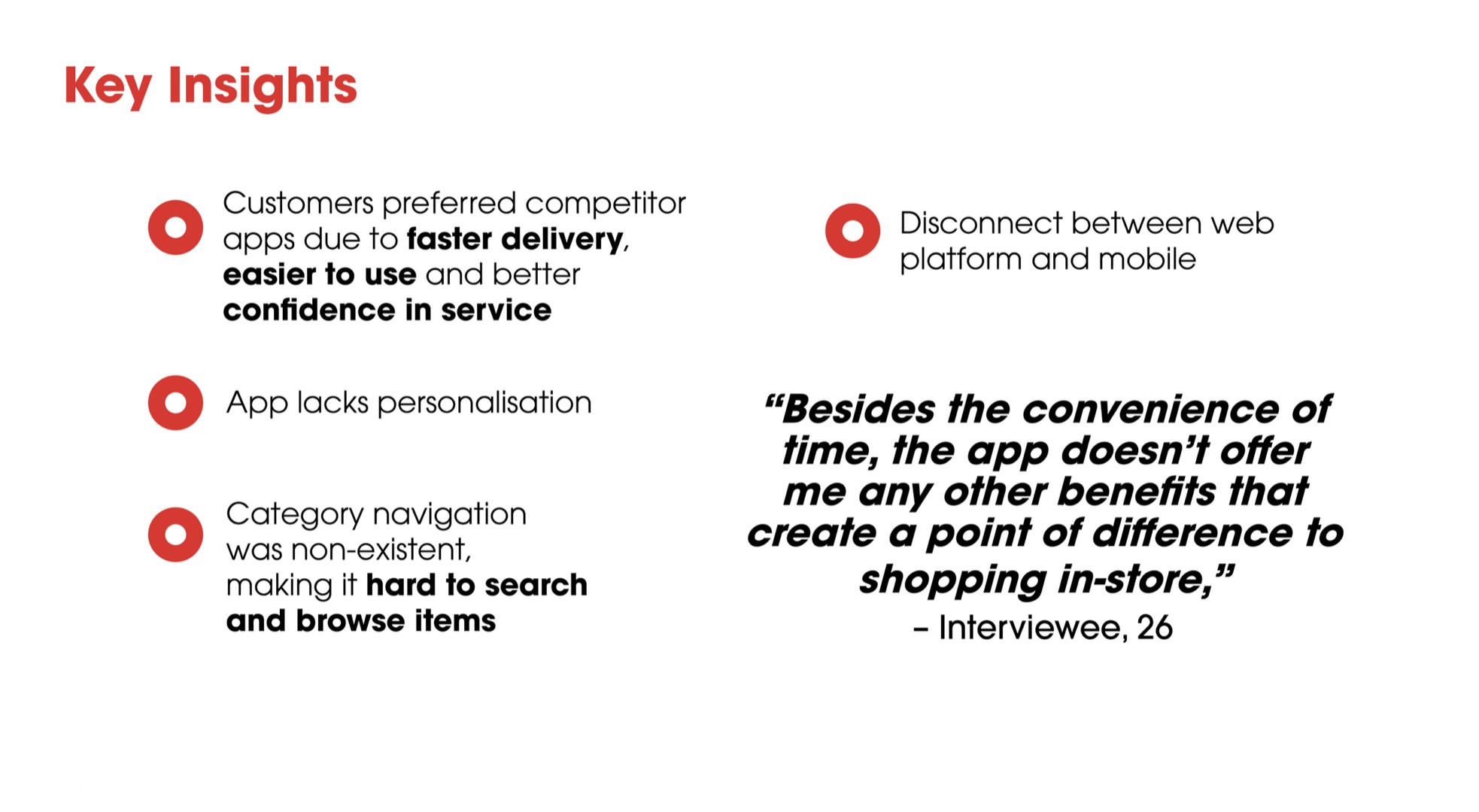
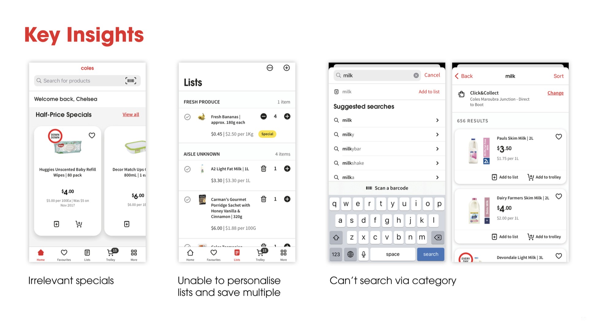
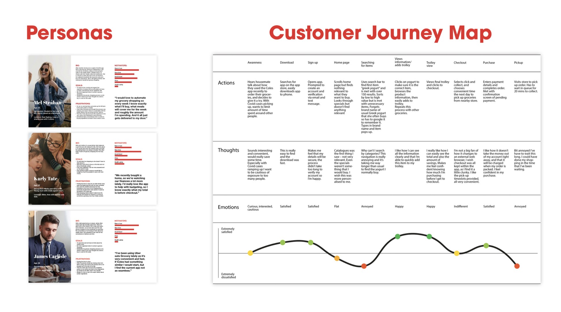
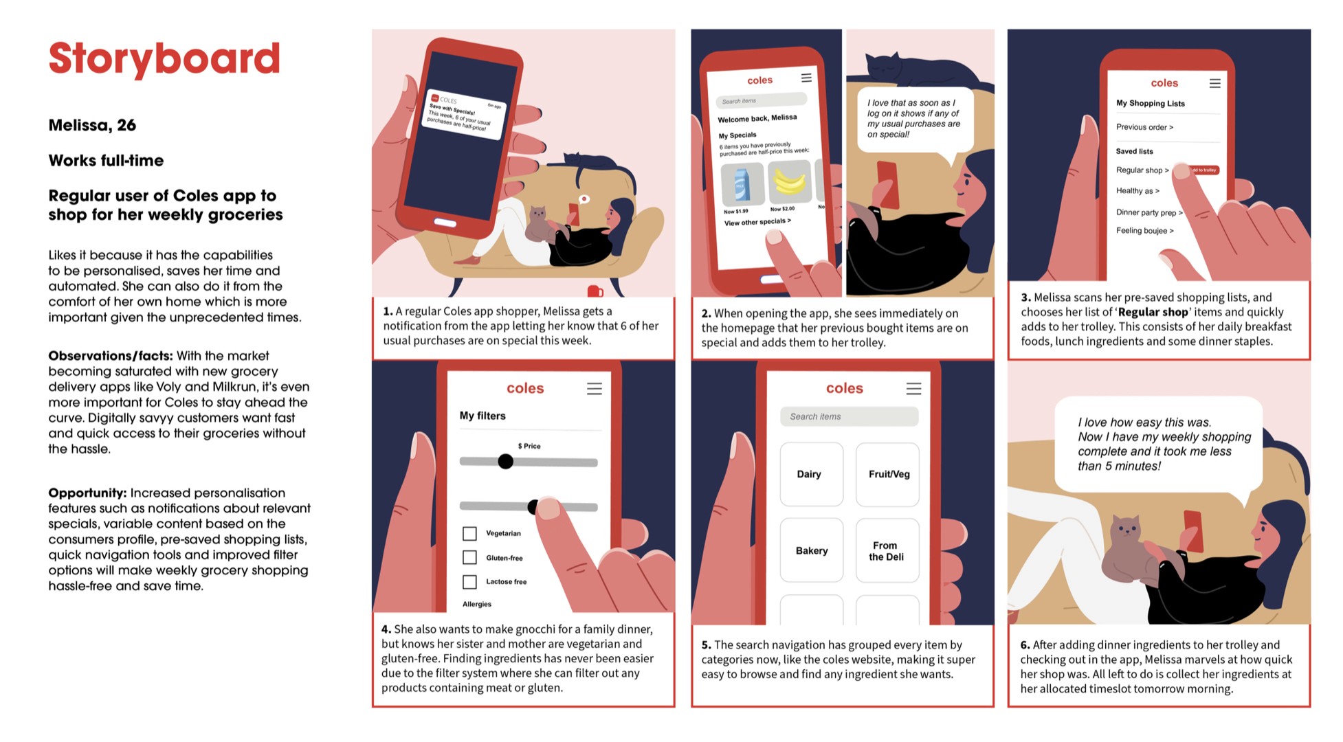
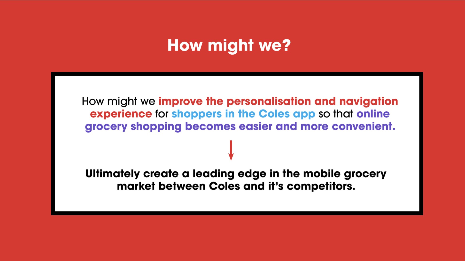
In this stage we discovered that the app was severely lacking in personalisation and navigation features, ultimately creating a clunky experience for online users. Thus, we focused our 'How might we?' on this:
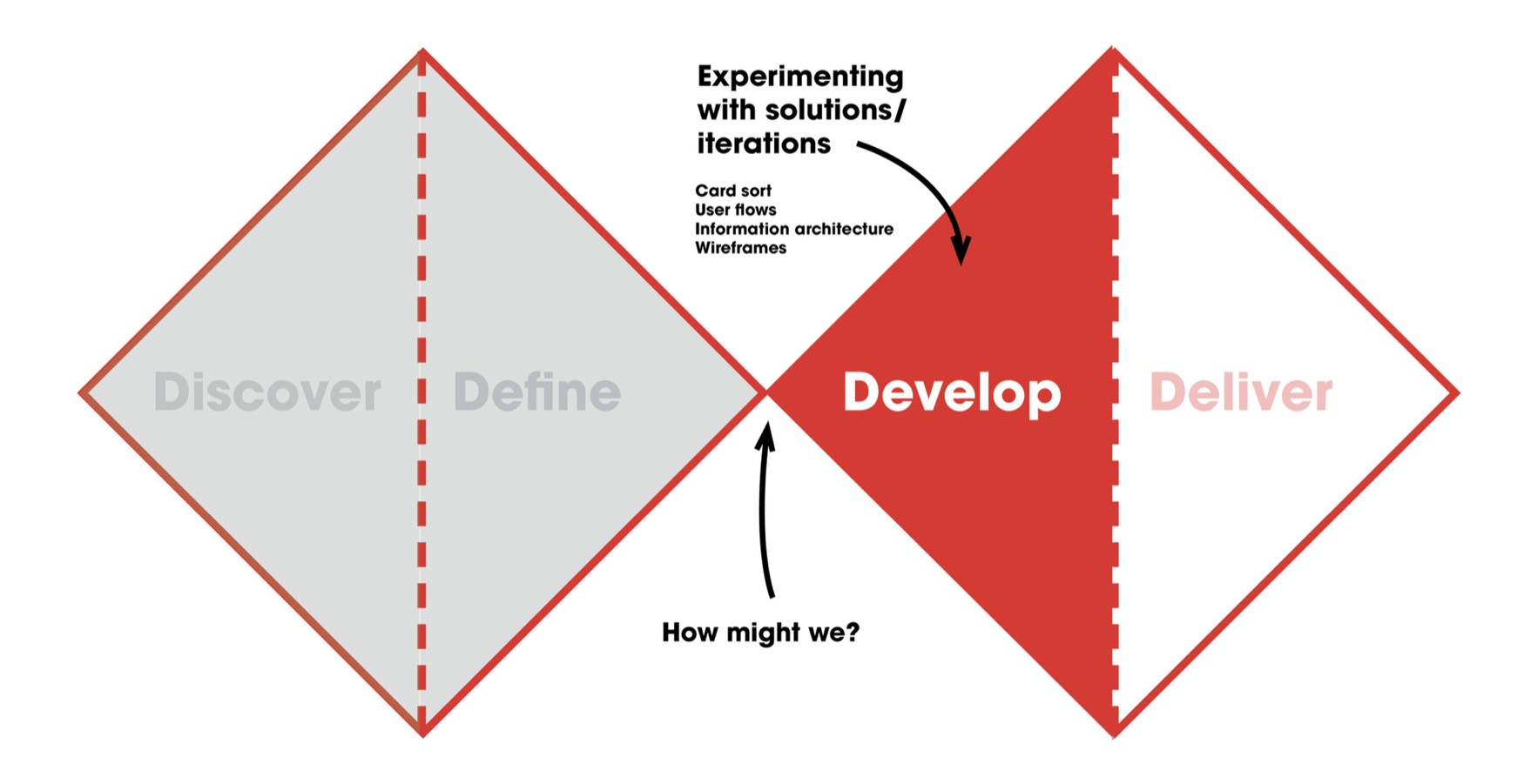
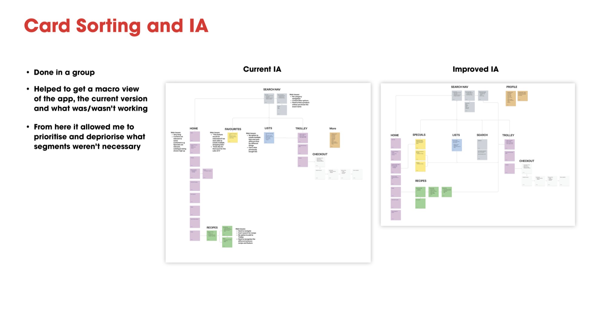
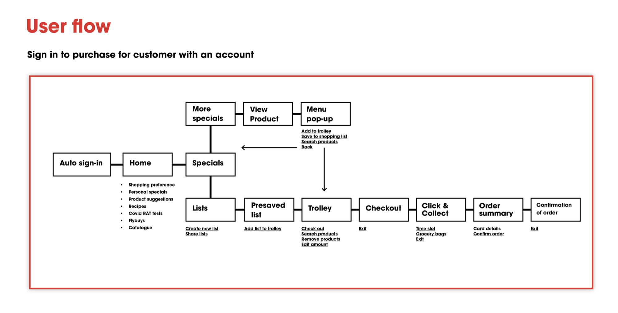
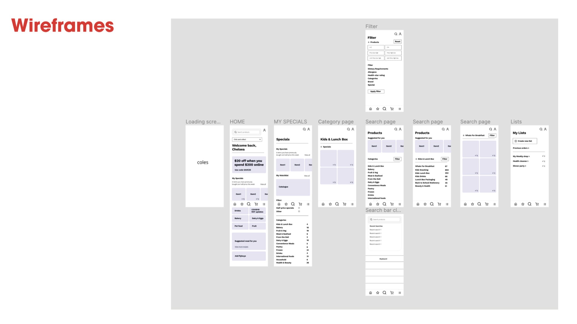
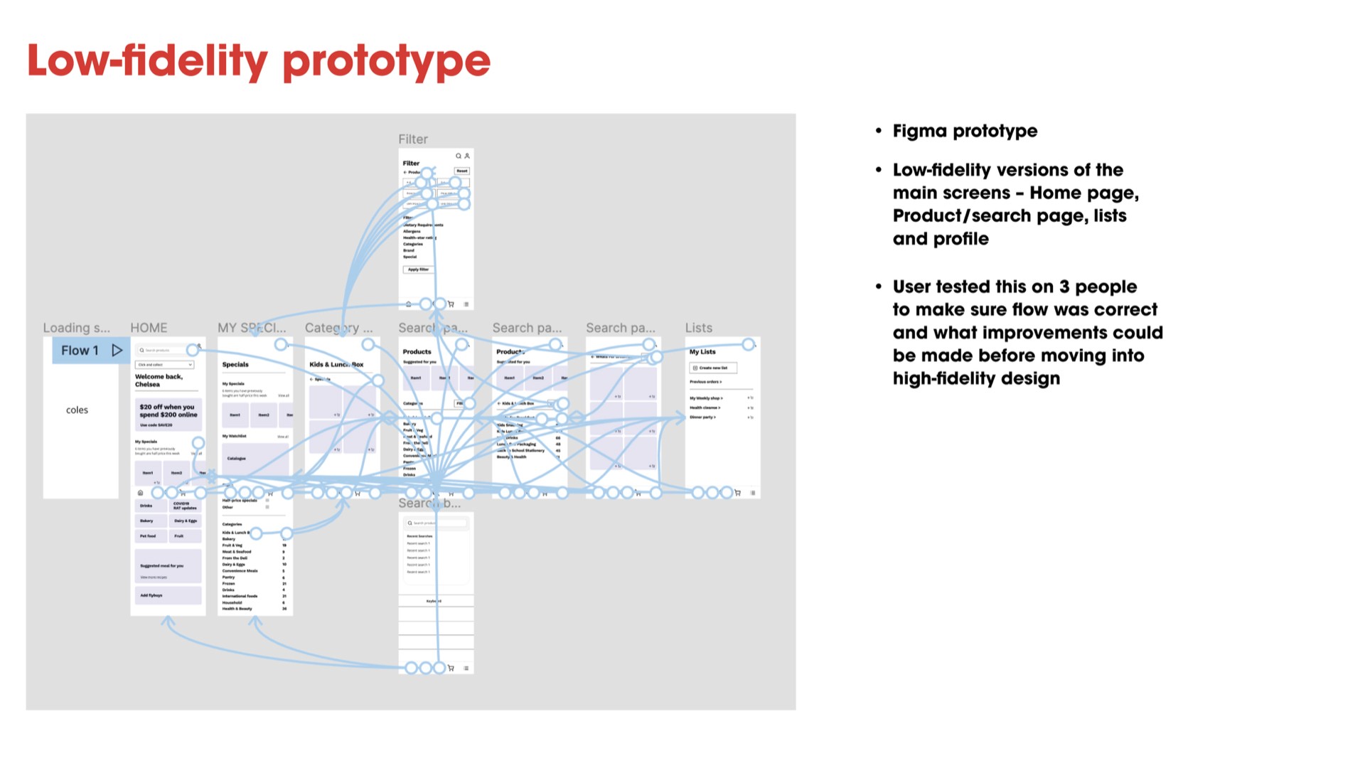
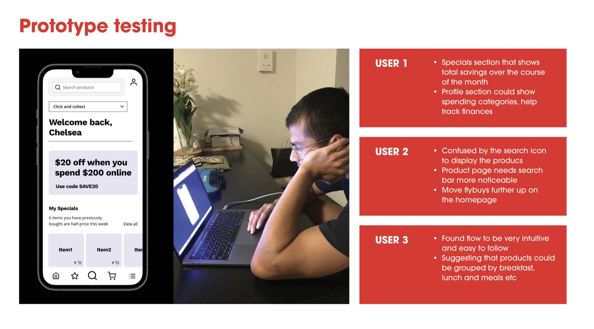
We then began developing a solution through iteration and experimentation, using the following methodologies of card sort, user flows, IA and wireframing.
Developing the solution