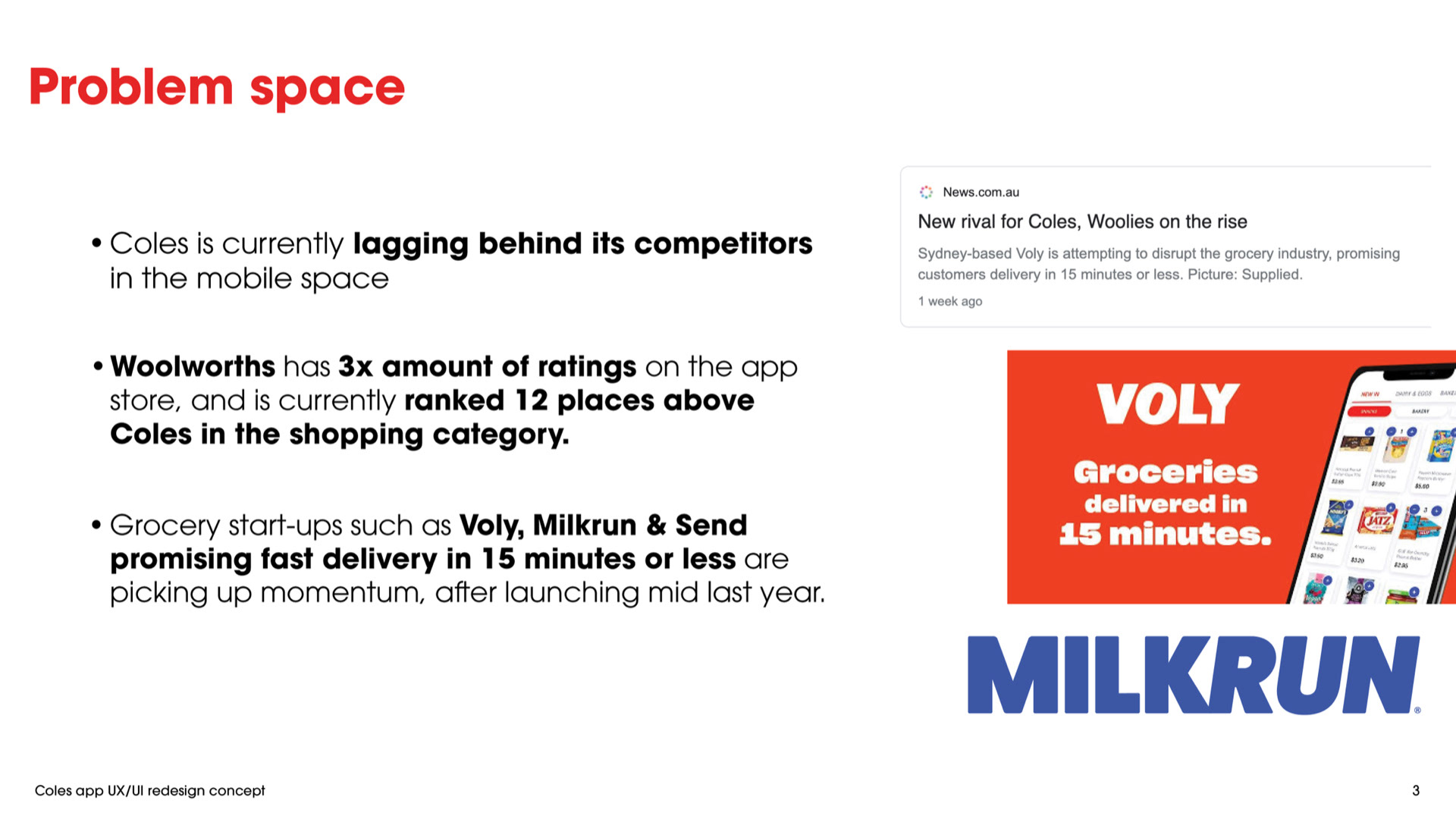
With the rise of competitors in the grocery delivery space, Coles was falling behind in their mobile application, despite being one of the leading supermarkets in Australia.
We were tasked with improving the UX of the Coles mobile app for customers who wanted to shop online, but found the current app inconvenient to use and lacking in comparison to competitors.
My role: UX/UI Designer
Client: Coles
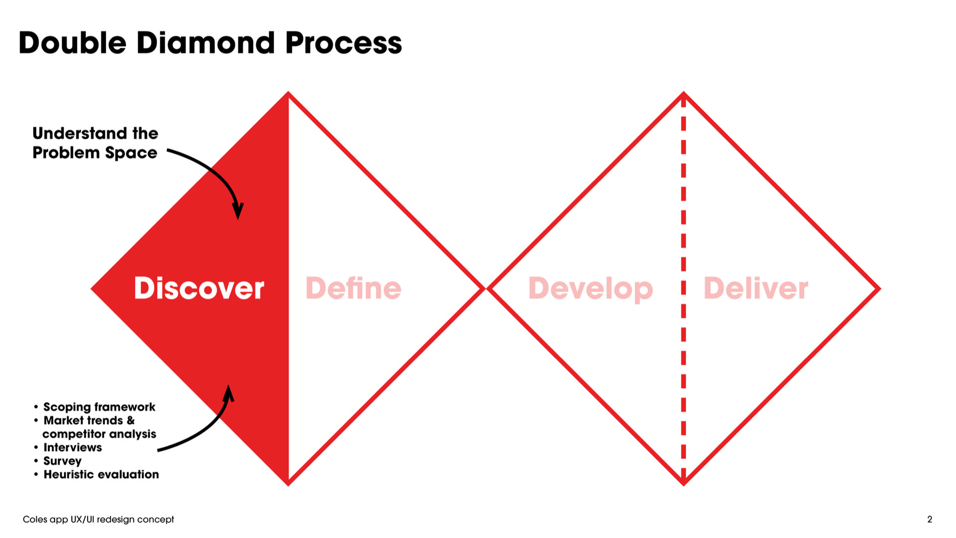
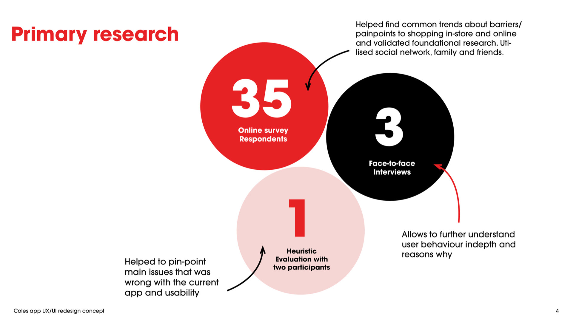
An agile approach was utilised throughout the project to first understand the problem space through methodologies such as scoping the market, competitor analysis, surveys & interviews.
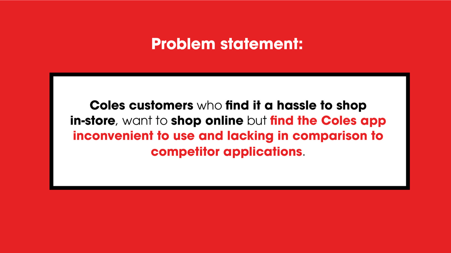
From our qualitative and quantitative research, this led us to our problem statement:
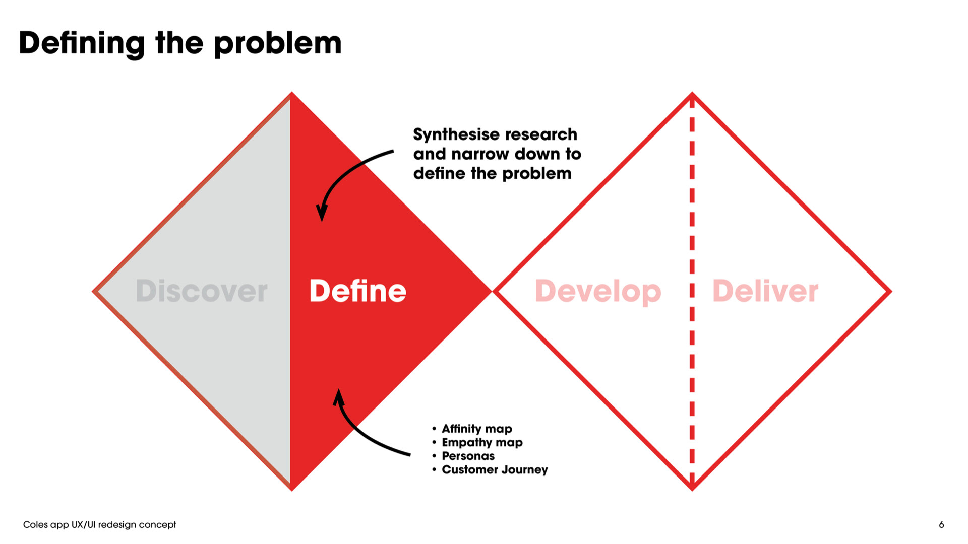
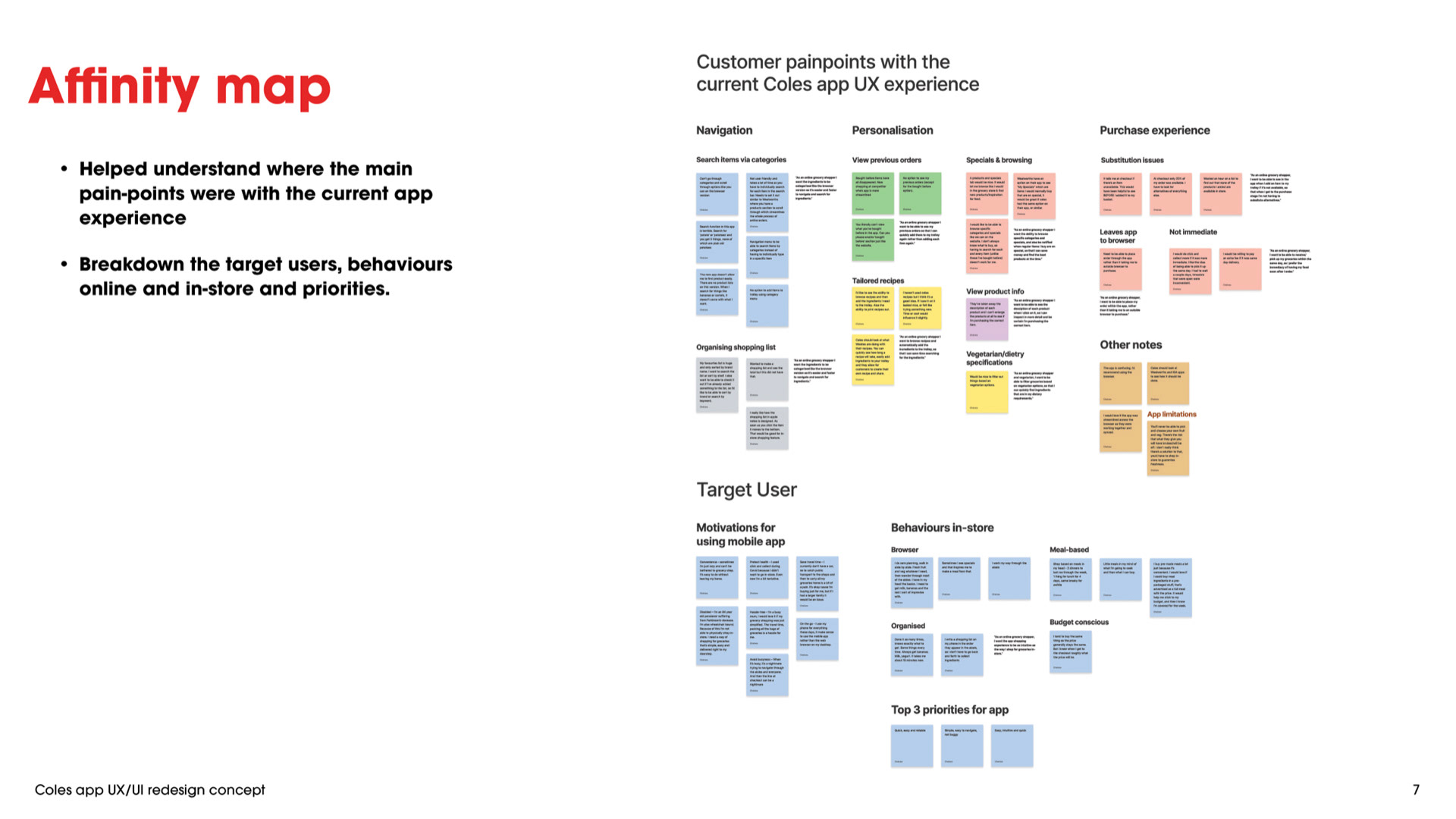
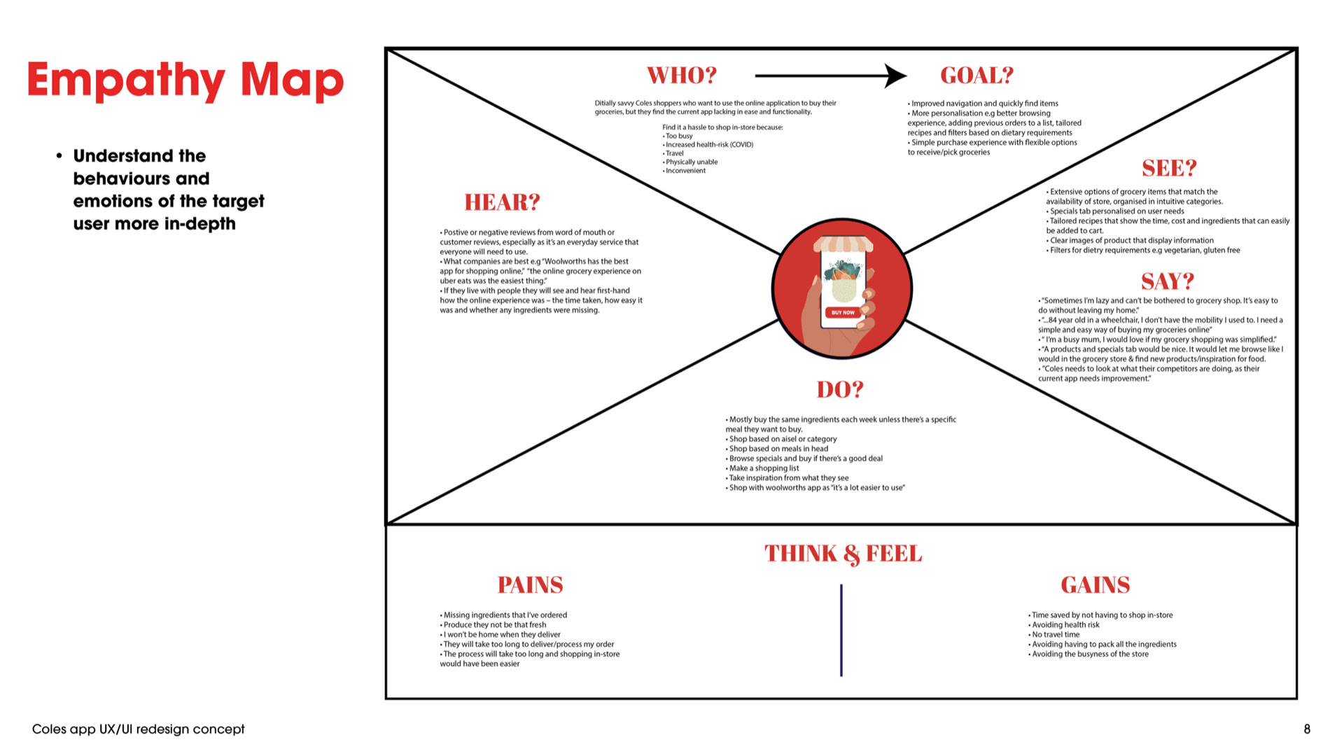
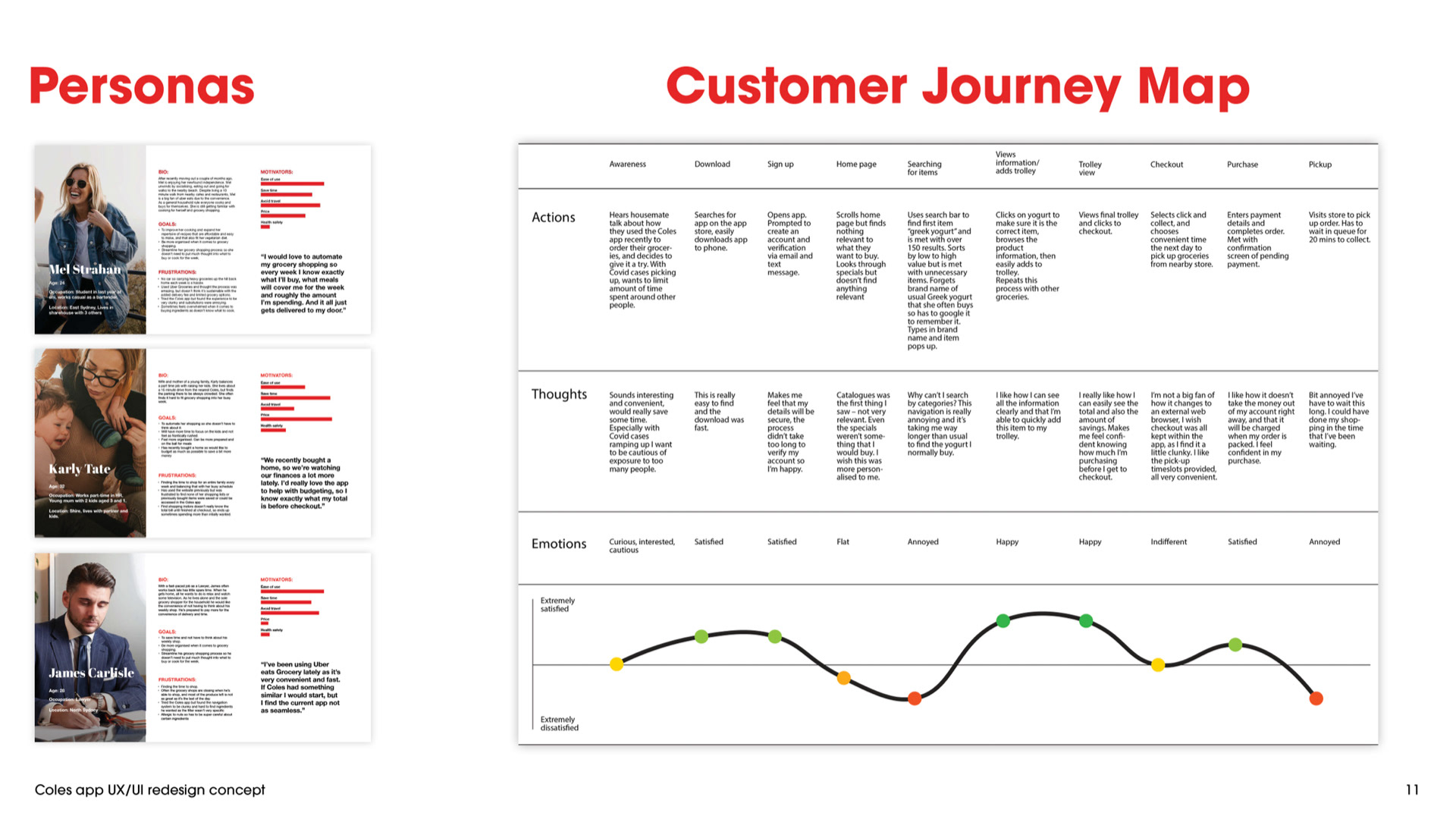
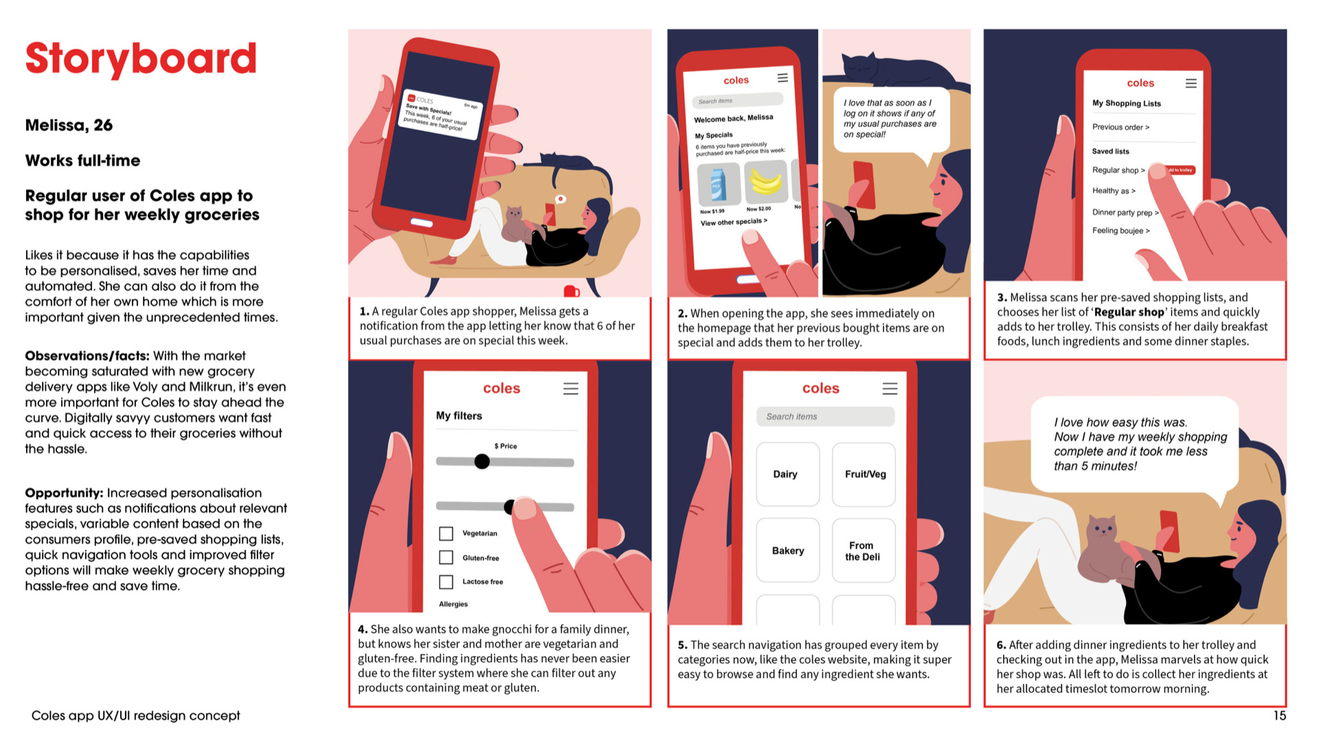
We then moved onto defining the problem by synthesising research through the methodologies of Affinity & empathy mapping, personas and customer journeys.
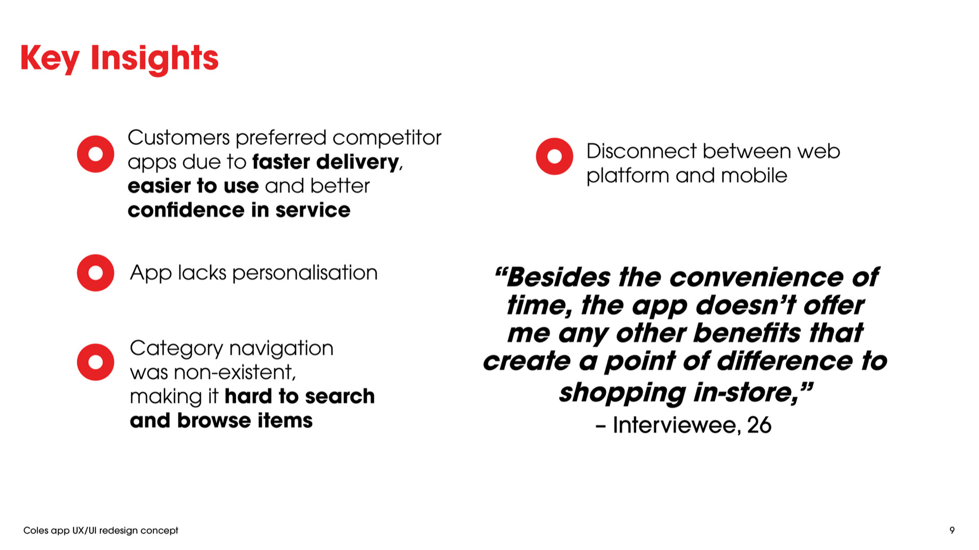
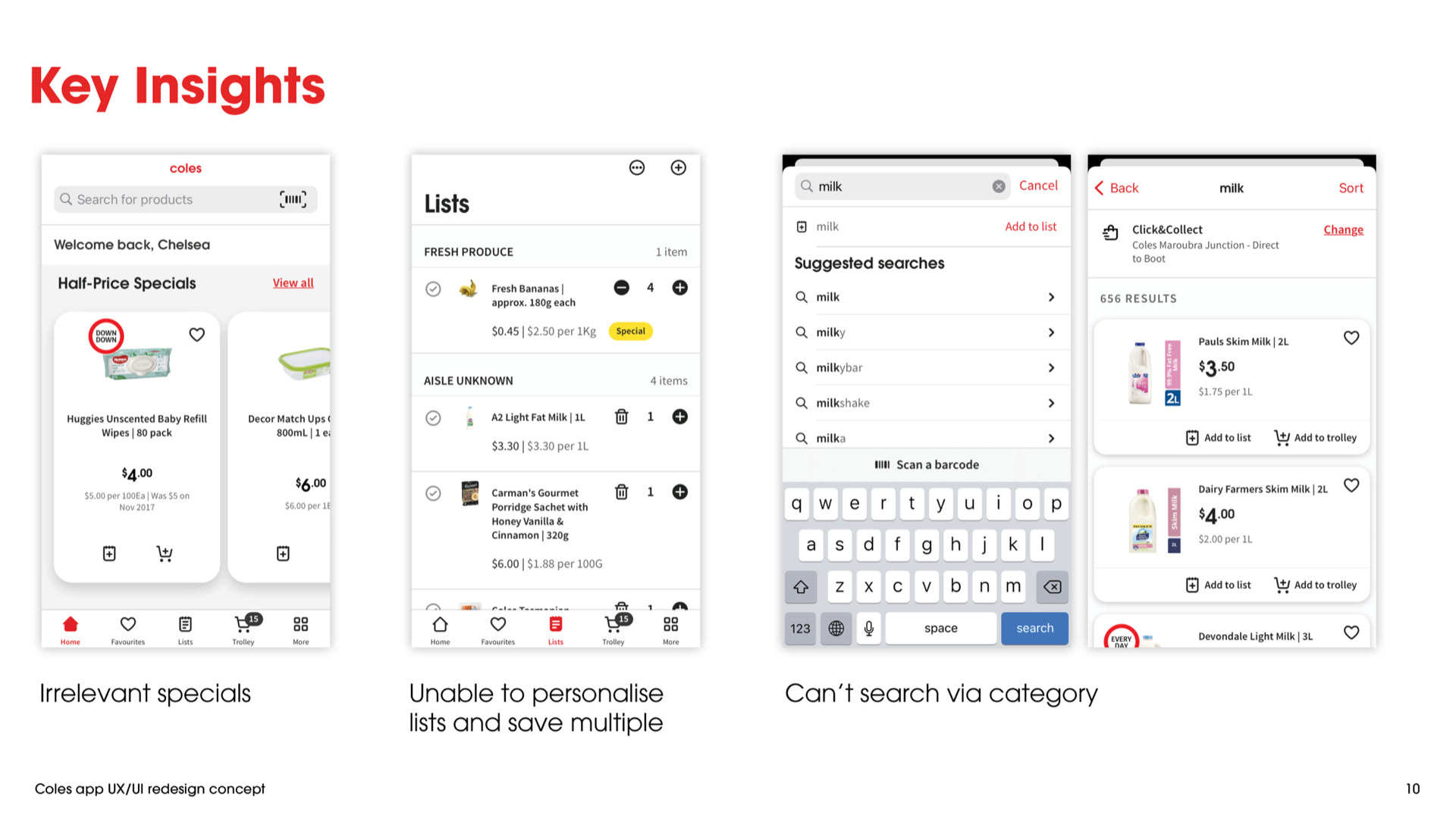
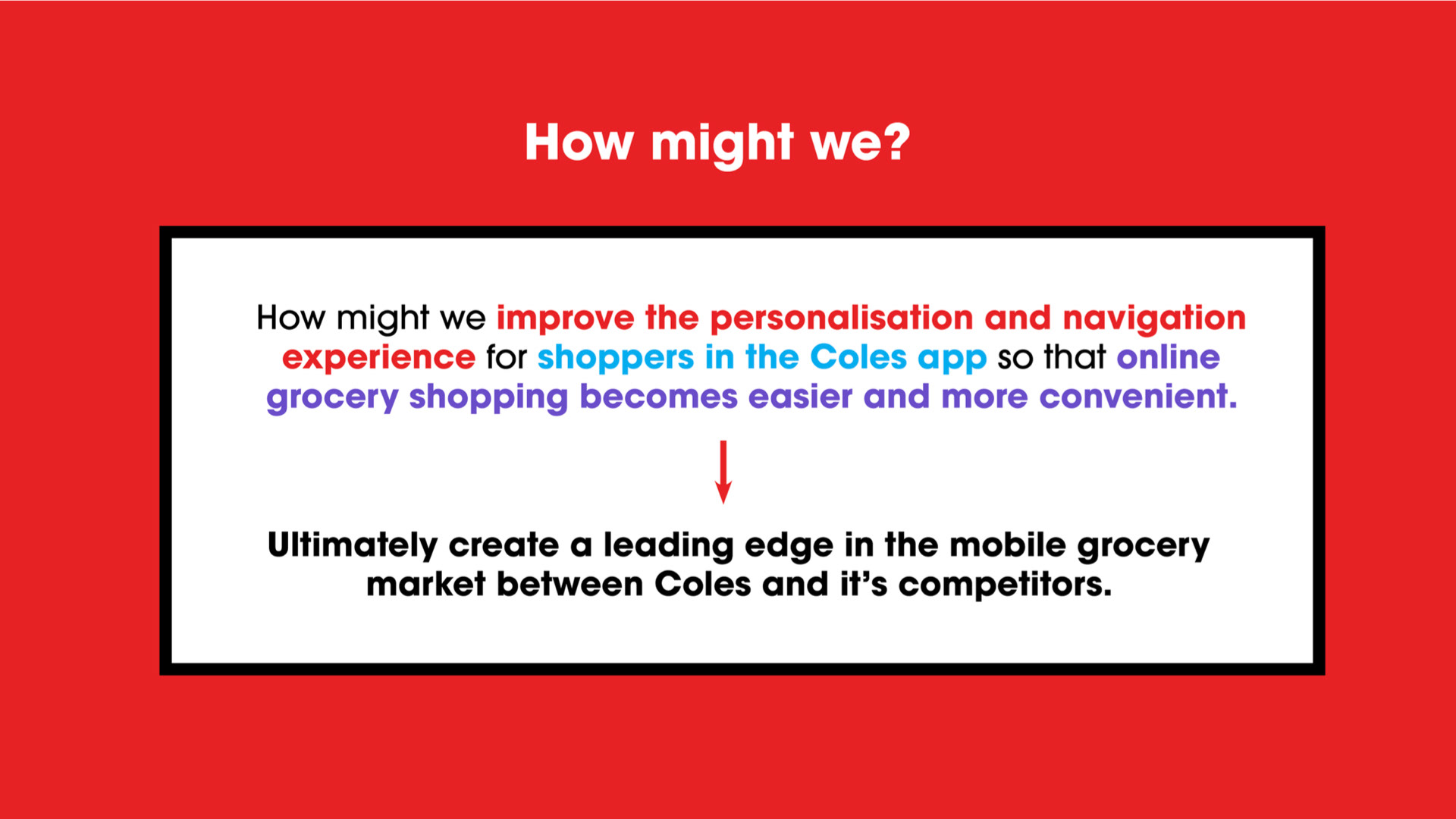
In this stage we discovered that the app was severely lacking in personalisation and navigation features, ultimately creating a clunky experience for online users. Thus, we focused our 'How might we?' on this:
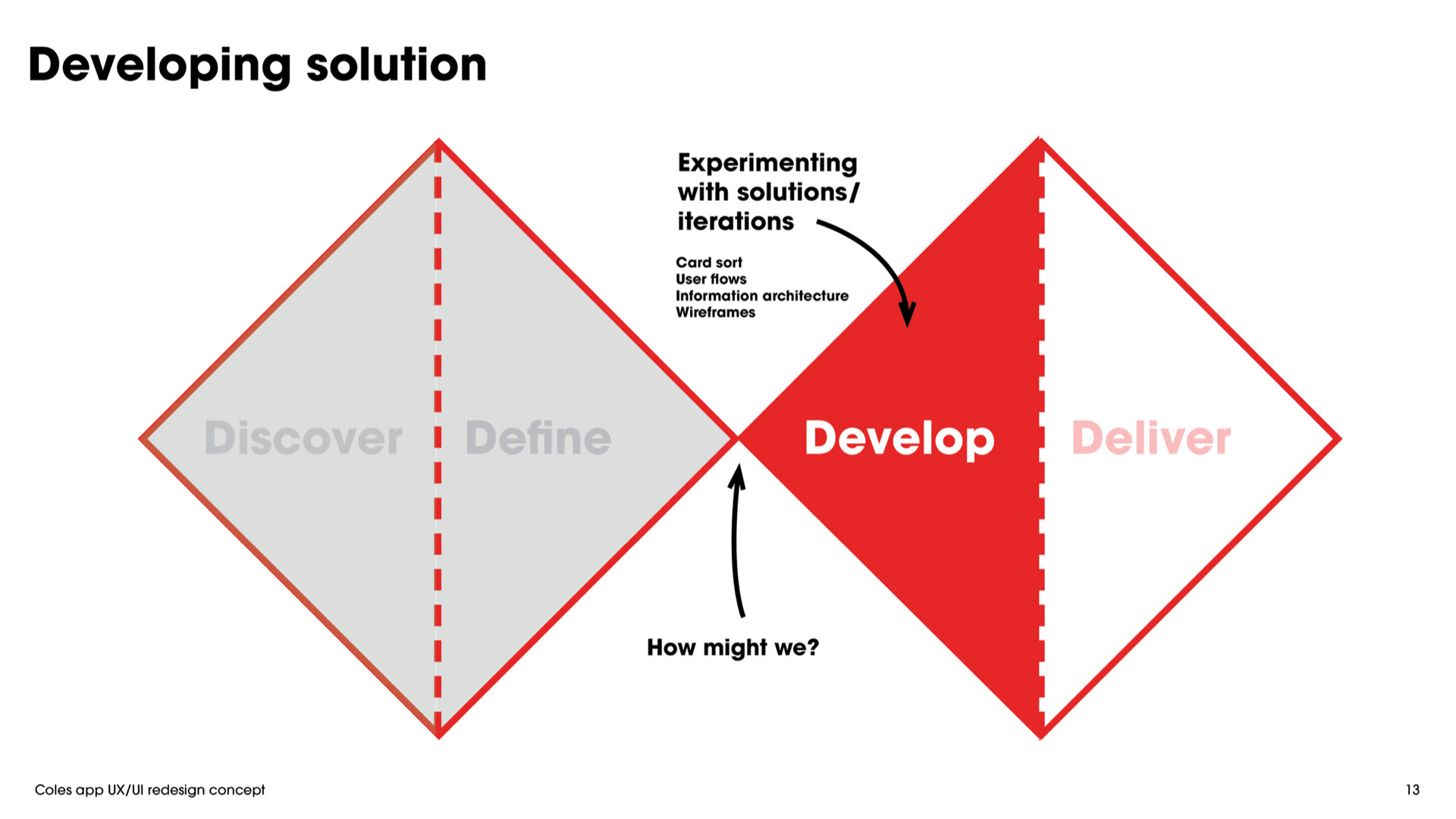
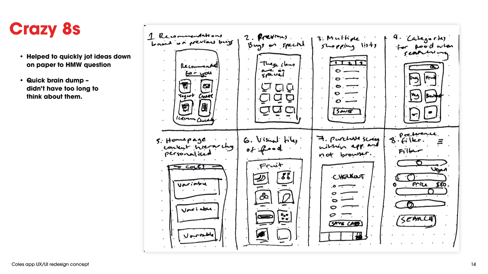
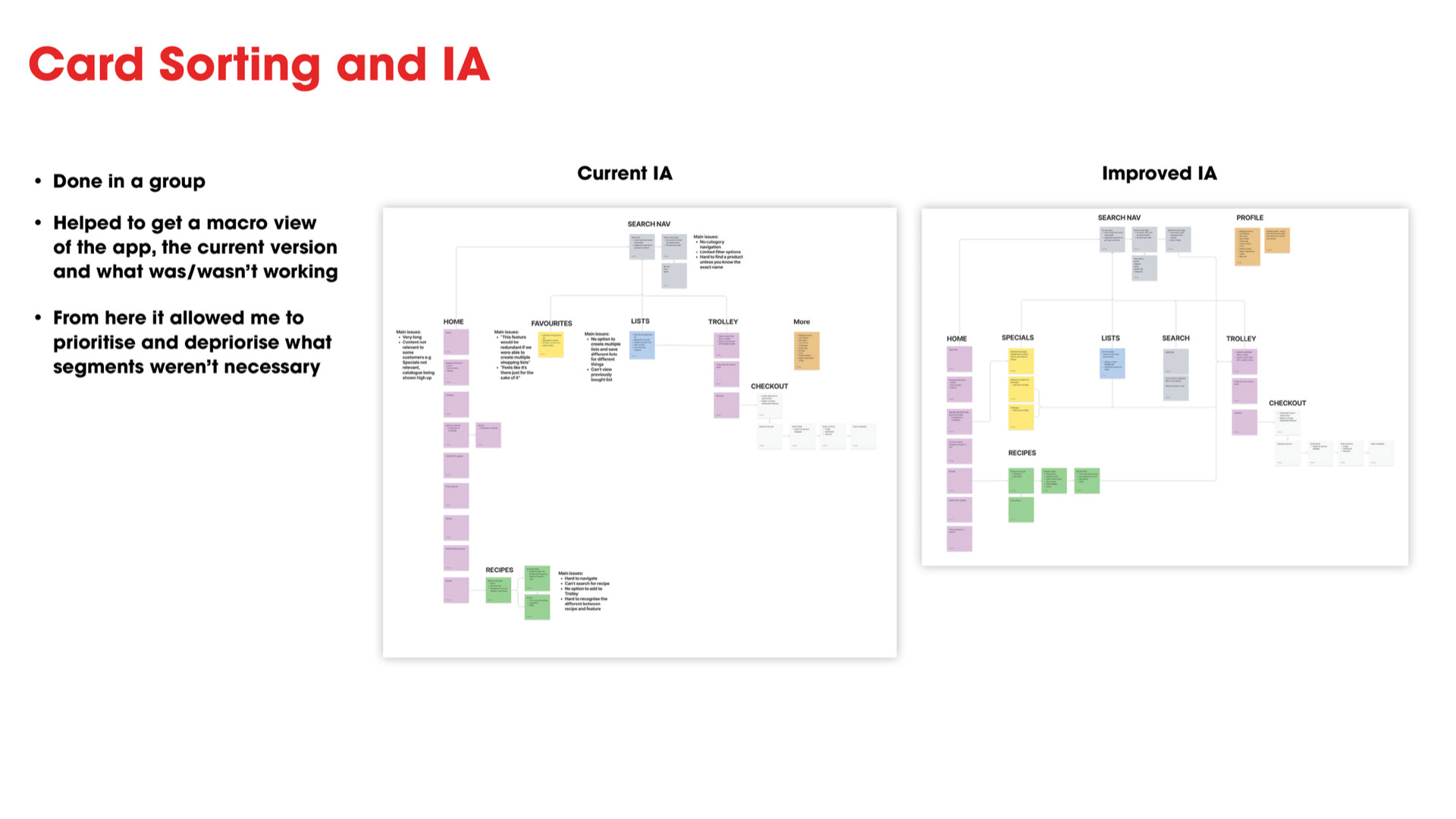
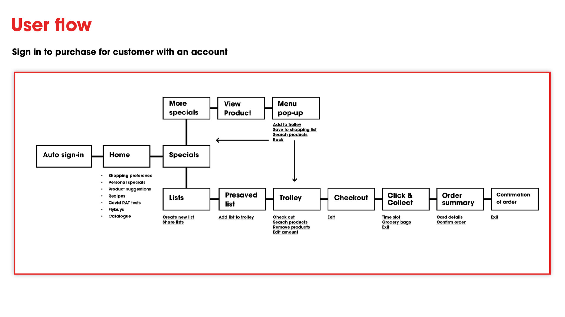
We then began developing a solution through iteration and experimentation, using the following methodologies of card sort, user flows, IA and wireframing.
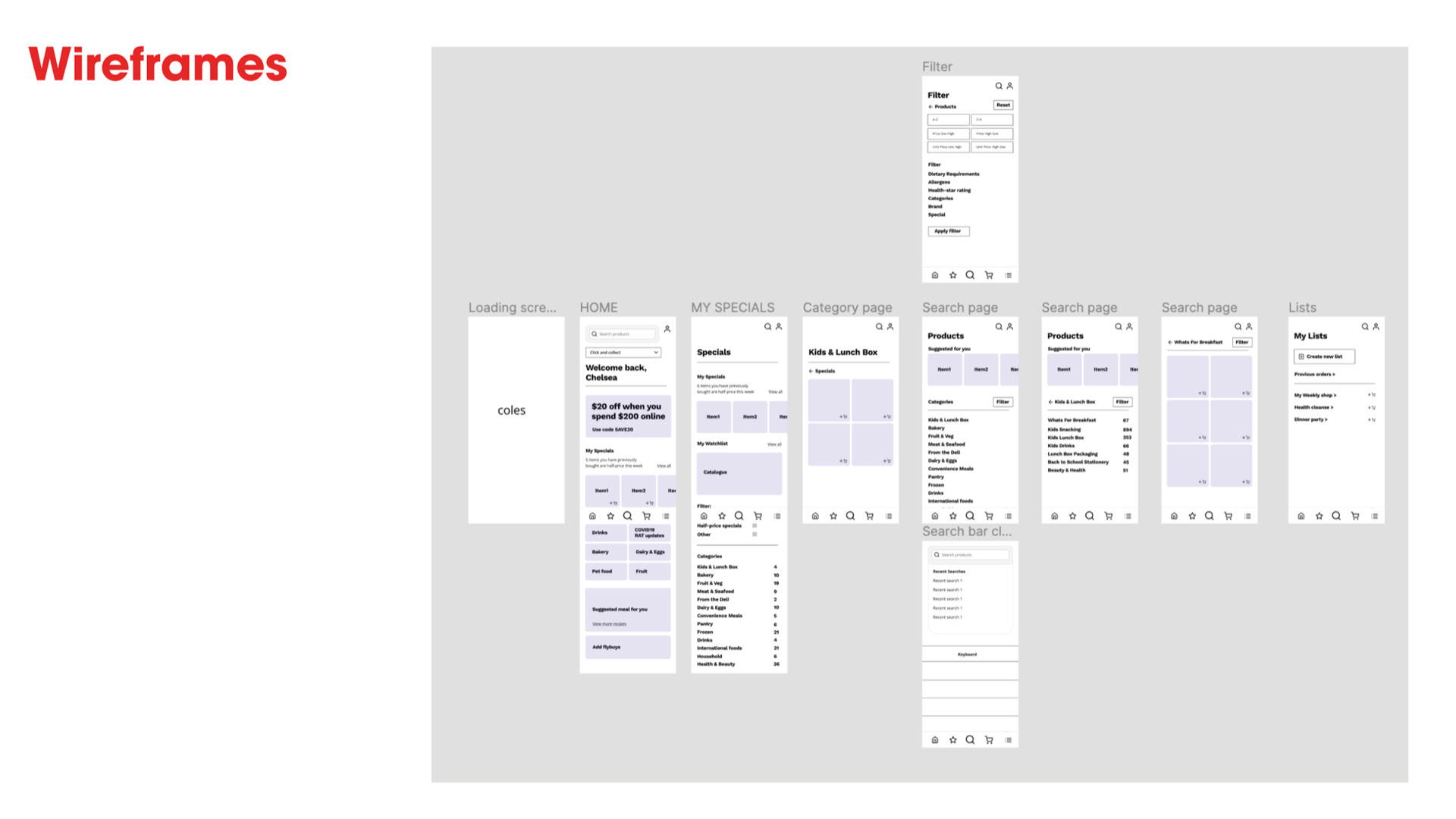
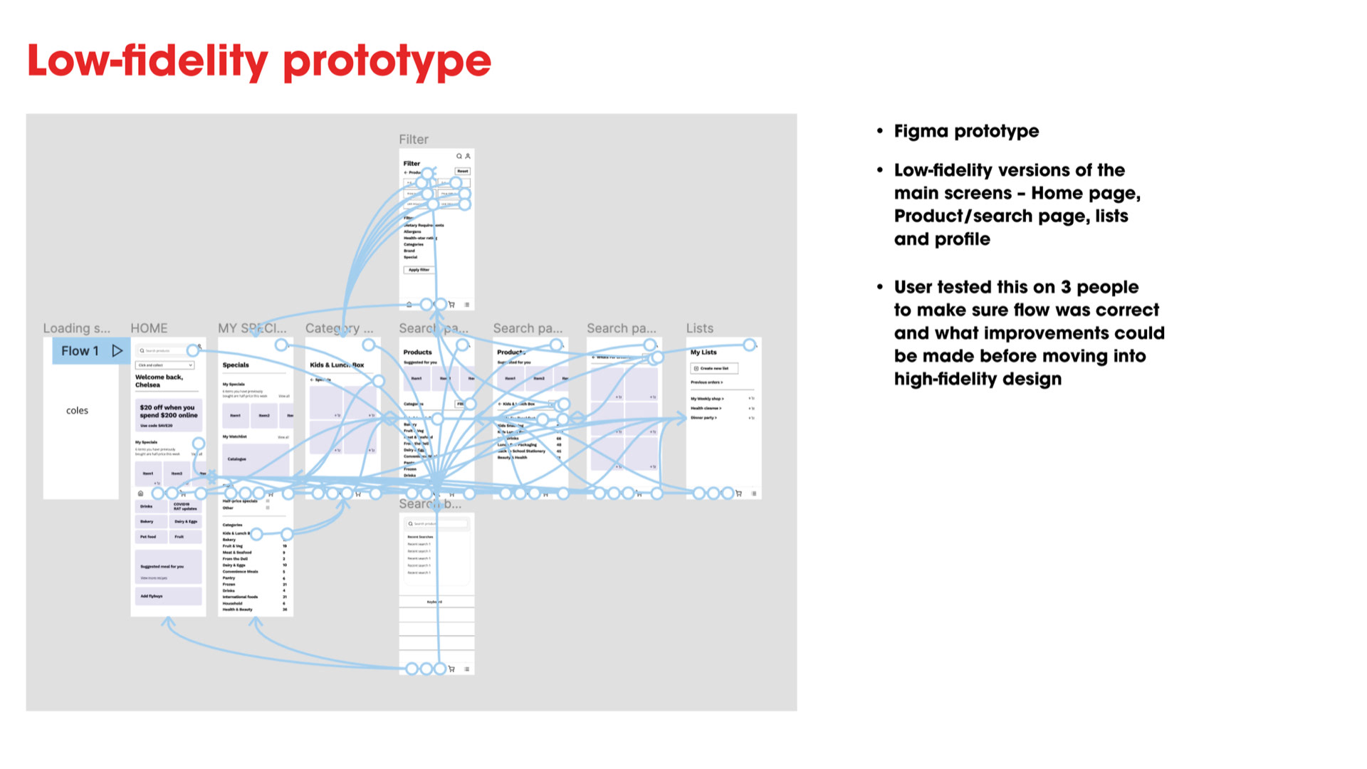
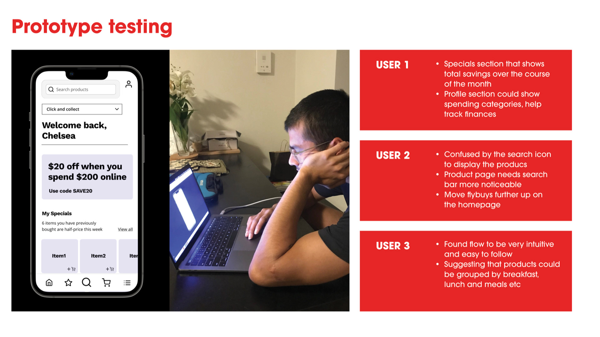
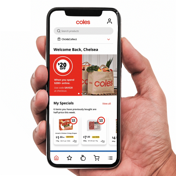
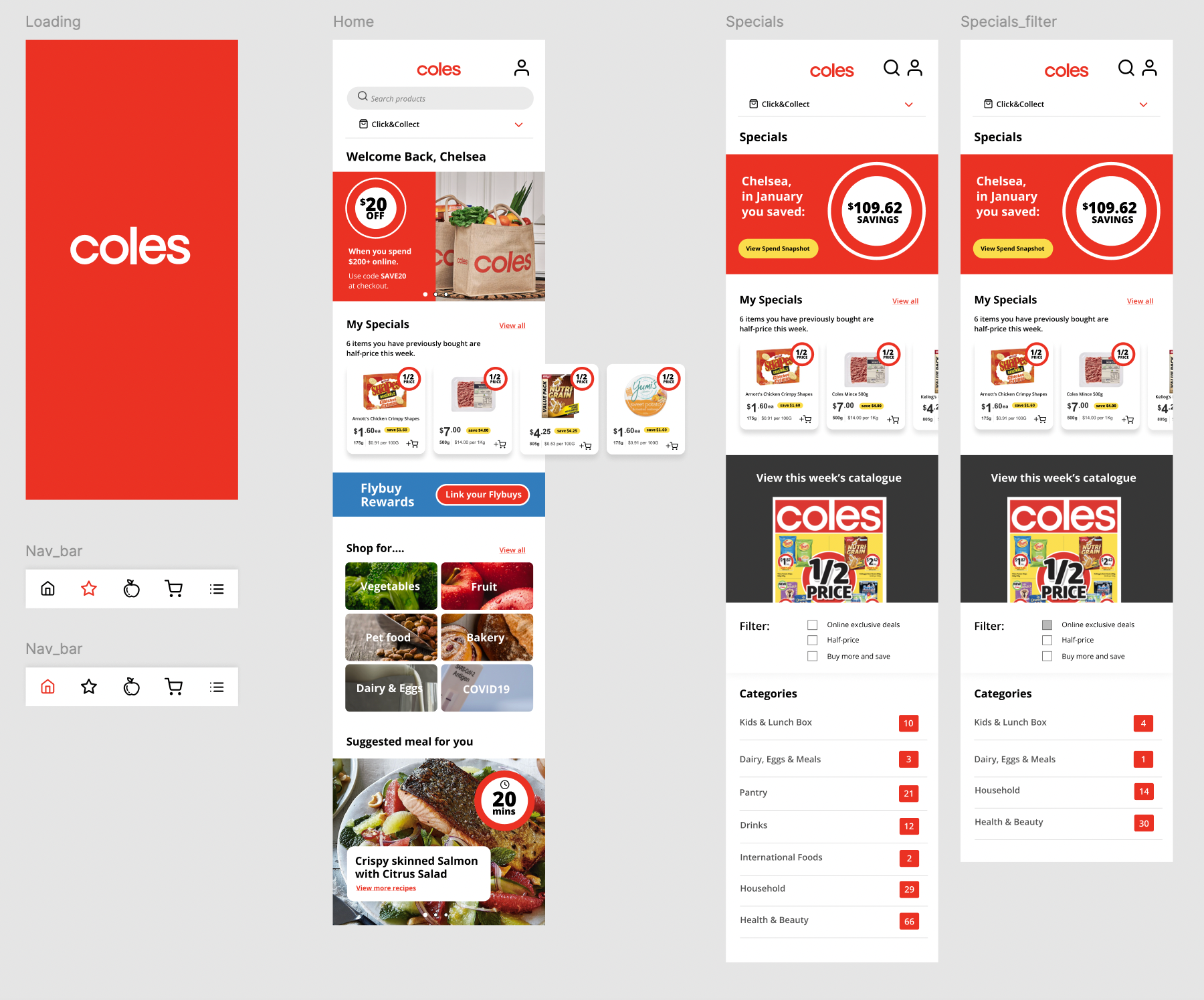
After using testing the low-fidelity wireframes, this helped identify some minor changes to features that could help further improve the user experience. These were then actioned in the high fidelity prototype (as seen below).