Brokerpedia is a “wikipedia” for aggregators and mortgage brokers.
A common pain point for brokers is spending many hours of research, calling banks and searching the web for the latest industry updates. Brokerpedia ultimately cuts that time in half by providing brokers with an online resource tool that does everything for them, from rate comparison, calculations, relevant news and the latest lender policy updates.
My role: As the sole UX/UI designer, I was responsible for improving website features to create a more seamless experience in the lead up to the product launch, while streamlining the branding so the UI was consistent across all mobile and web platforms. I redesigned the entire website in dark mode and worked closely with the company director, IT support and dev team from overseas.
- UX/UI design (mobile & web)
- User research
- Motion design
- User research
- Motion design
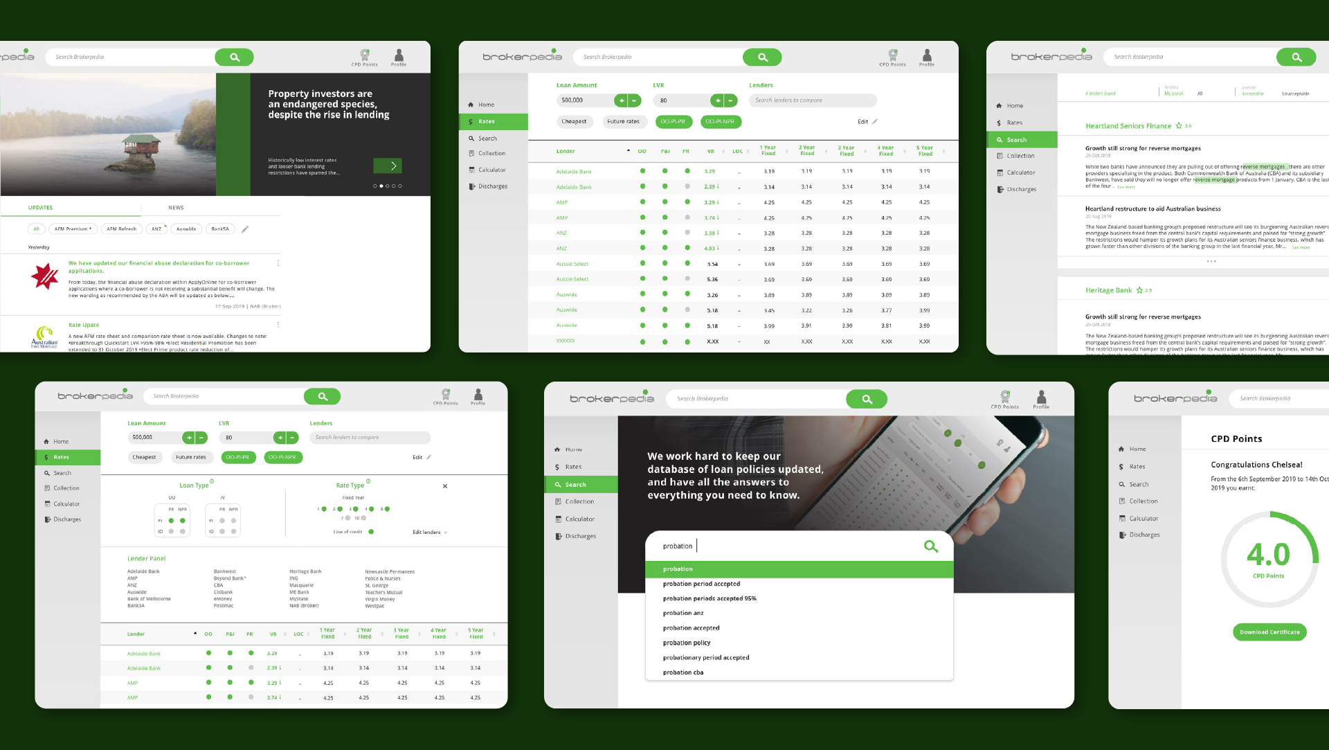
Dark Mode
After user feedback and competitor analysis, we added in a dark mode feature, turning the entire interface into a dark palette. Given the amount of text within the platform, our research showed that many users preferred the option of a dark interface, to make reading easier on the eye. We kept the green highlights buttons the same, but swapped the background to various shades of dark charcoals.

Adding 'Search' page
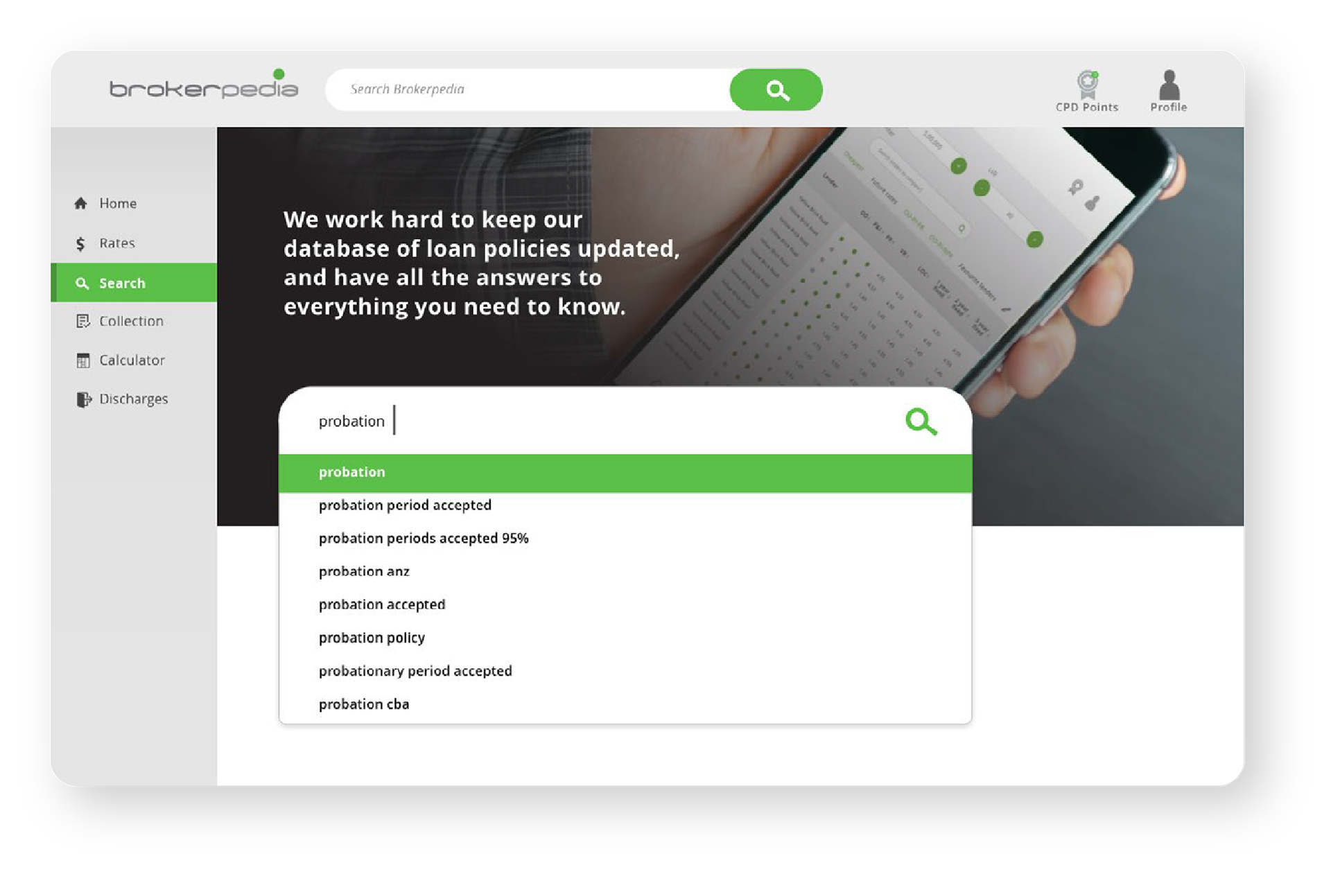
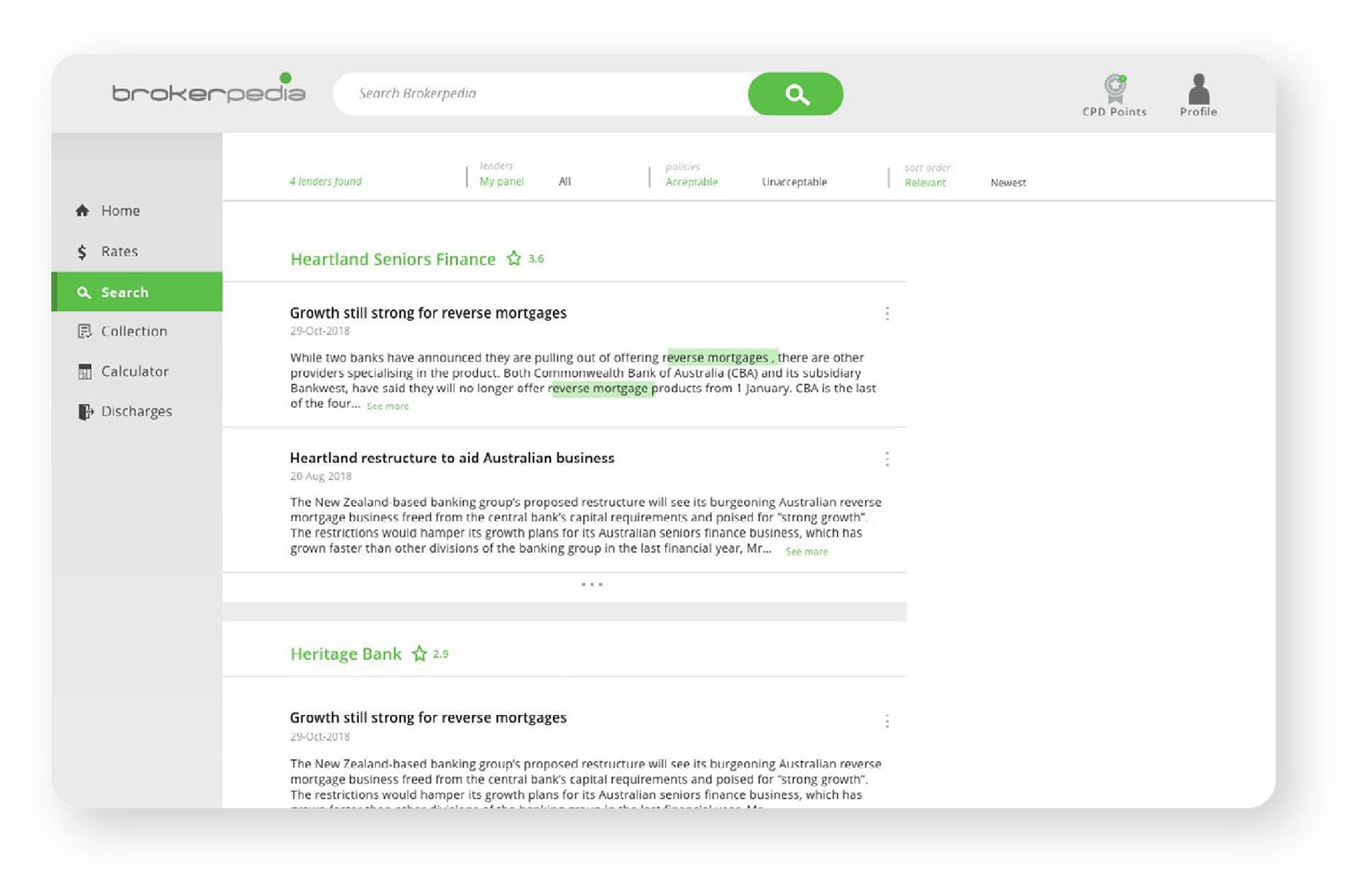

Previously search was missing from the navigation panel.
We identified some users would miss the search bar at the top and added in a search homepage to create a better user experience. We added a lender rating system to make it easier for brokers to find the best relevant lender articles and introduced a feedback function.
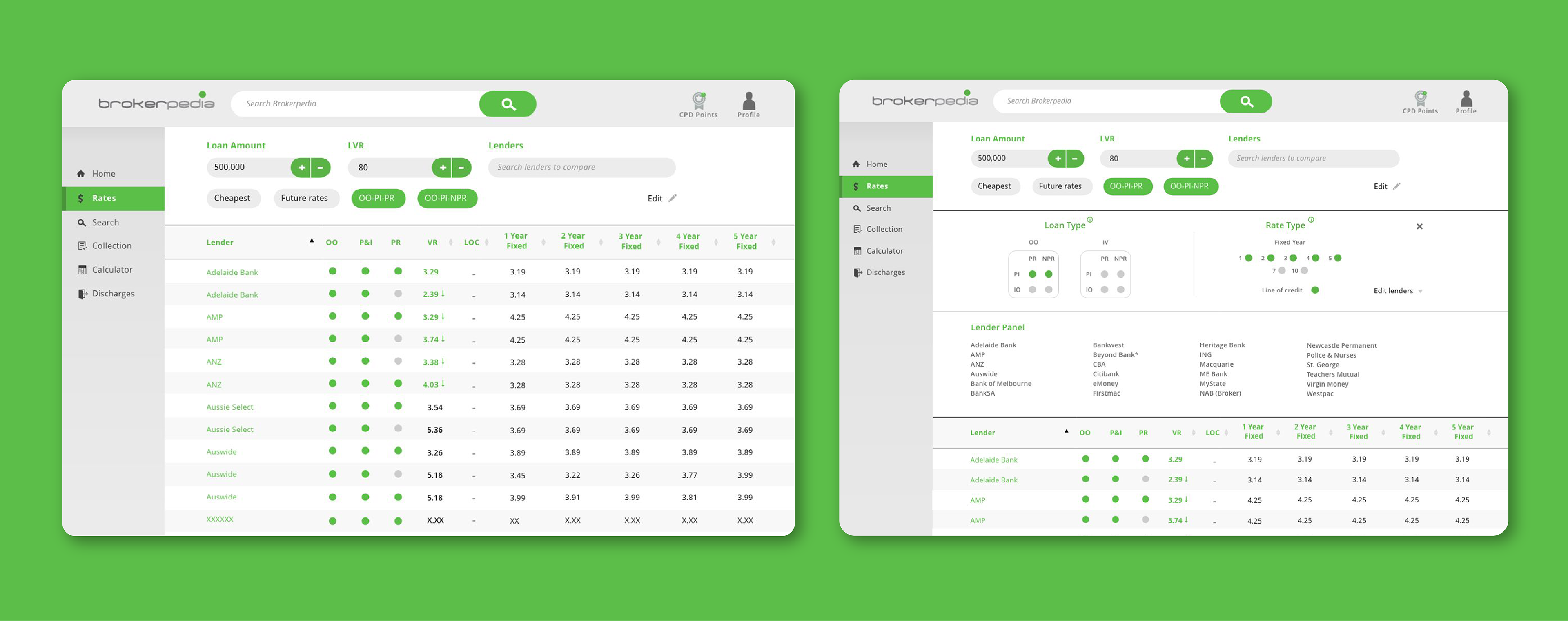
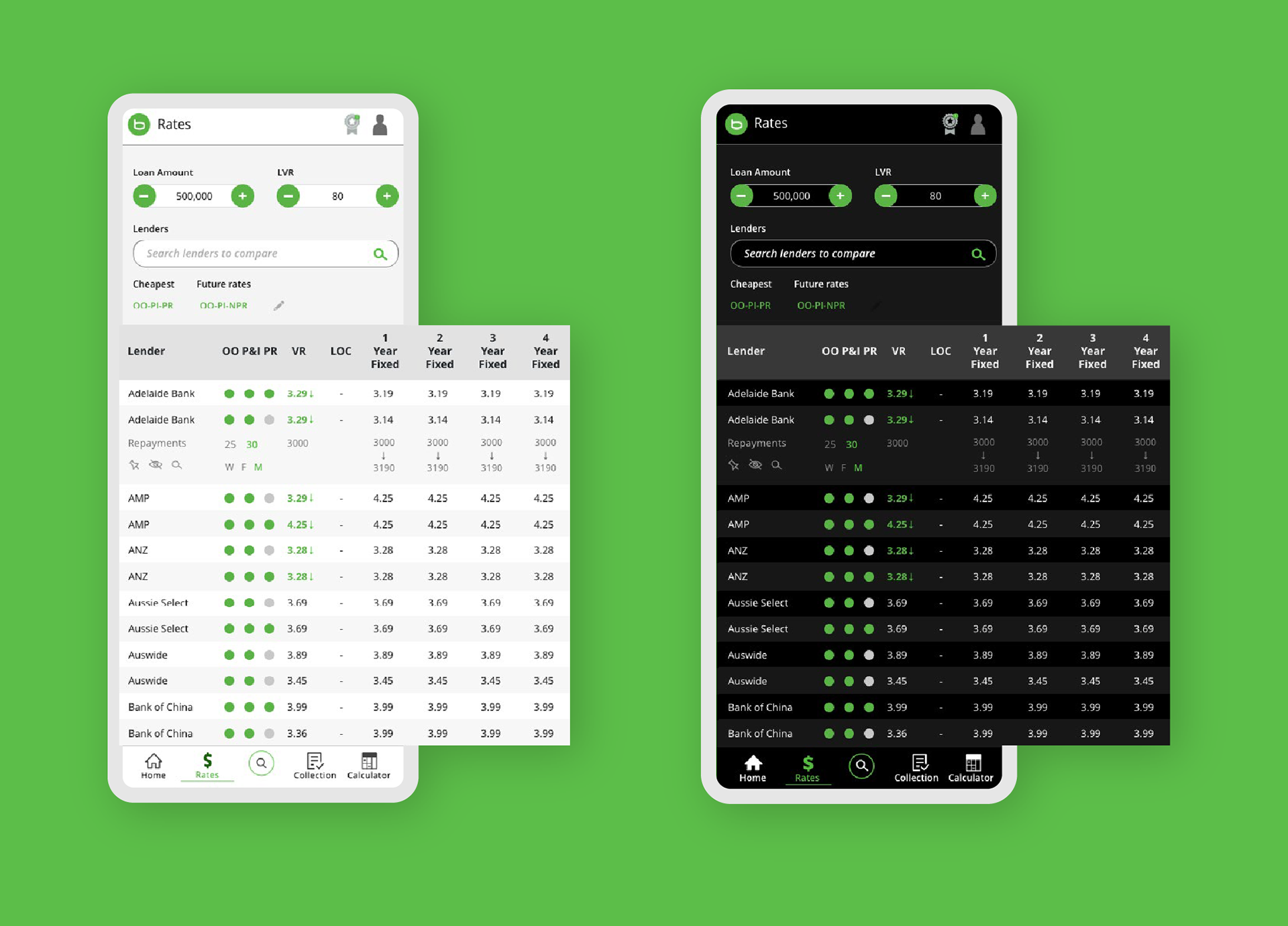
Rates Page
We simplified the filters and created drop down panels to create a cleaner interface that could be collapsible.
Added repayment feature: When a lender is clicked on, this expands to reveal a row beneath that reveals the repayment calculations each year. This saves brokers time from entering several figures into the calculator for each year, allowing them to quickly compare between lenders.
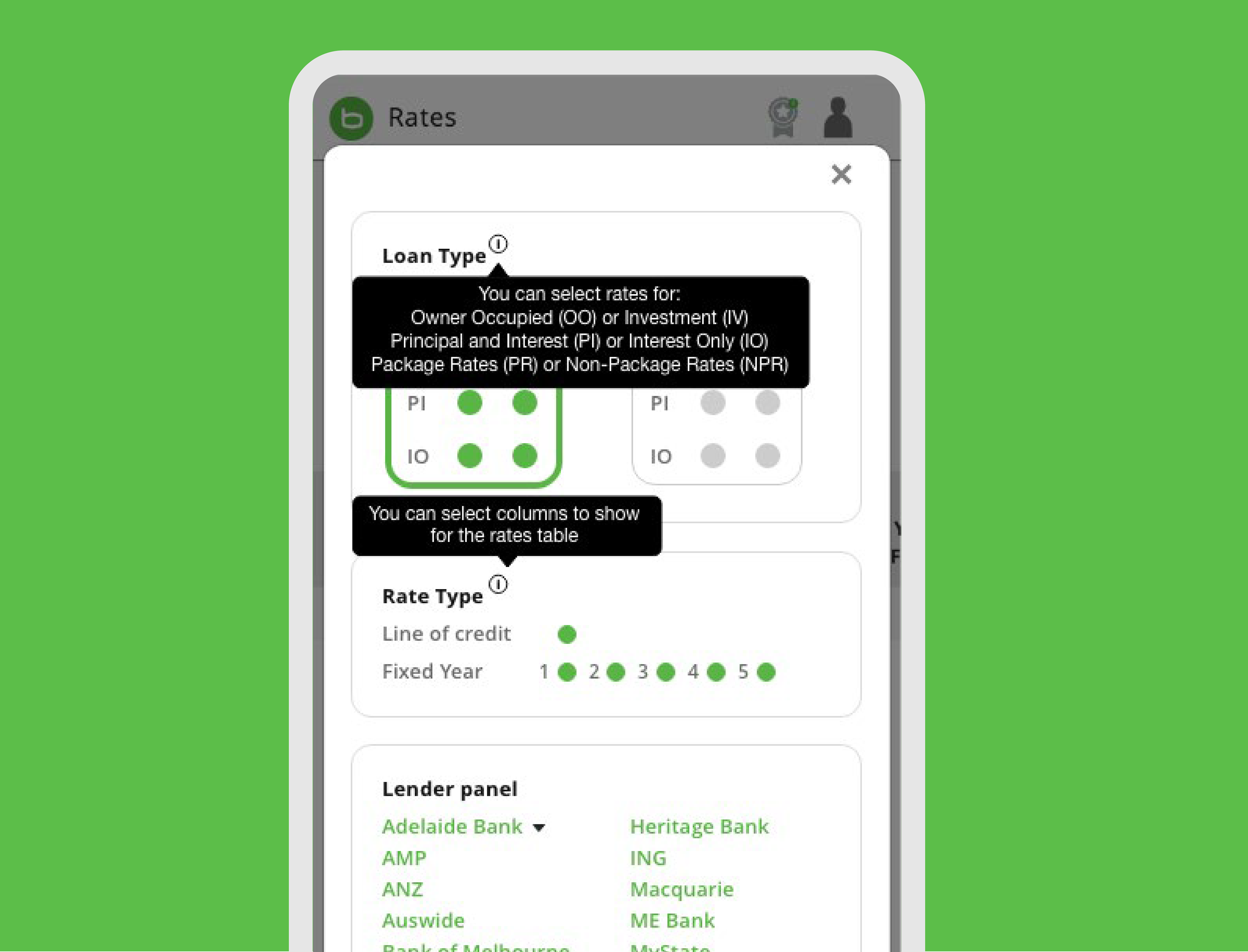
Added pop up captions when info icon is clicked to explain the feature to the customer, as some first-time users may not understand terminology or features.